

Mercedes-Benz Financial Services.
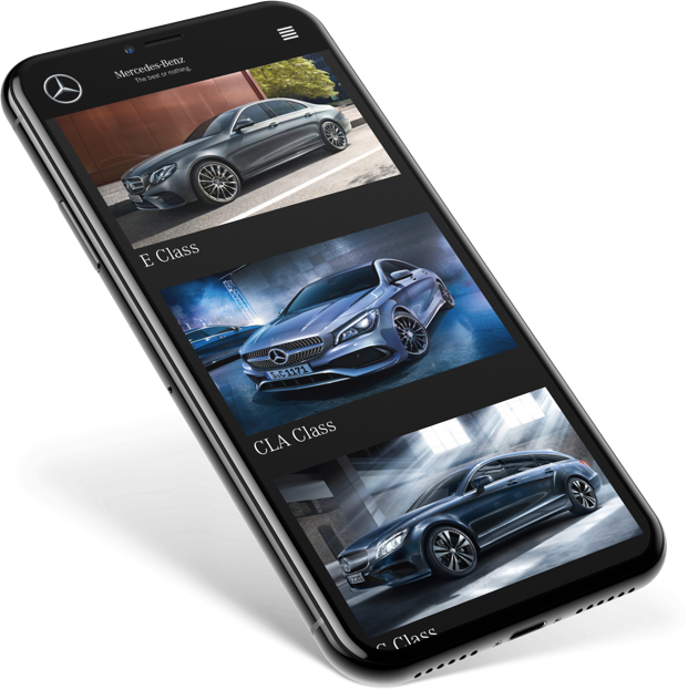
Upgrade has never been easier than now.
Mercedes-Benz is a global automobile brand known for luxury vehicles, buses, coaches, and lorries. Their financial services provide tailored packages to help their customers own their dream car.
Due to the highly competitive vehicle finance market the client needed an engaging experience that focuses on illustrating the value Mercedes-Benz Financial Services (MBFS) offers.
Currently there’s no digital tool that engages existing customers before the end of their current financial term and provides actionable next steps in order to upgrade from their current vehicle. The solution should also accomodate its usage in the dealership to deliver value to the dealer network.
A rather complicated internal process does not allow the client to test and release products in an agile way. They needed a partner who can deliver and validate ideas fast as well as understand limitations and legal requirements while still keeping it aspirational.
Illustrate value and ease to upgrade by creating an aspirational affordability calculator that guides existing customers through available options to upgrade before the end of their current financial term. Tailored to individual needs tool leads Mercedes owners to book a test drive or submit an online finance application.
Number of booked test drives and submitted applications.
I led the design execution of the project as well as ideation activities. I was a part of the team defining requirements, the roadmap and prioritisation sessions.

Discovery phase helped me understand the business context, risks and opportunities. I used existing data, user segmentation and personas to learn about the users, their behaviour and needs.
Based on that I created scenarios that helped me prioritise these needs.


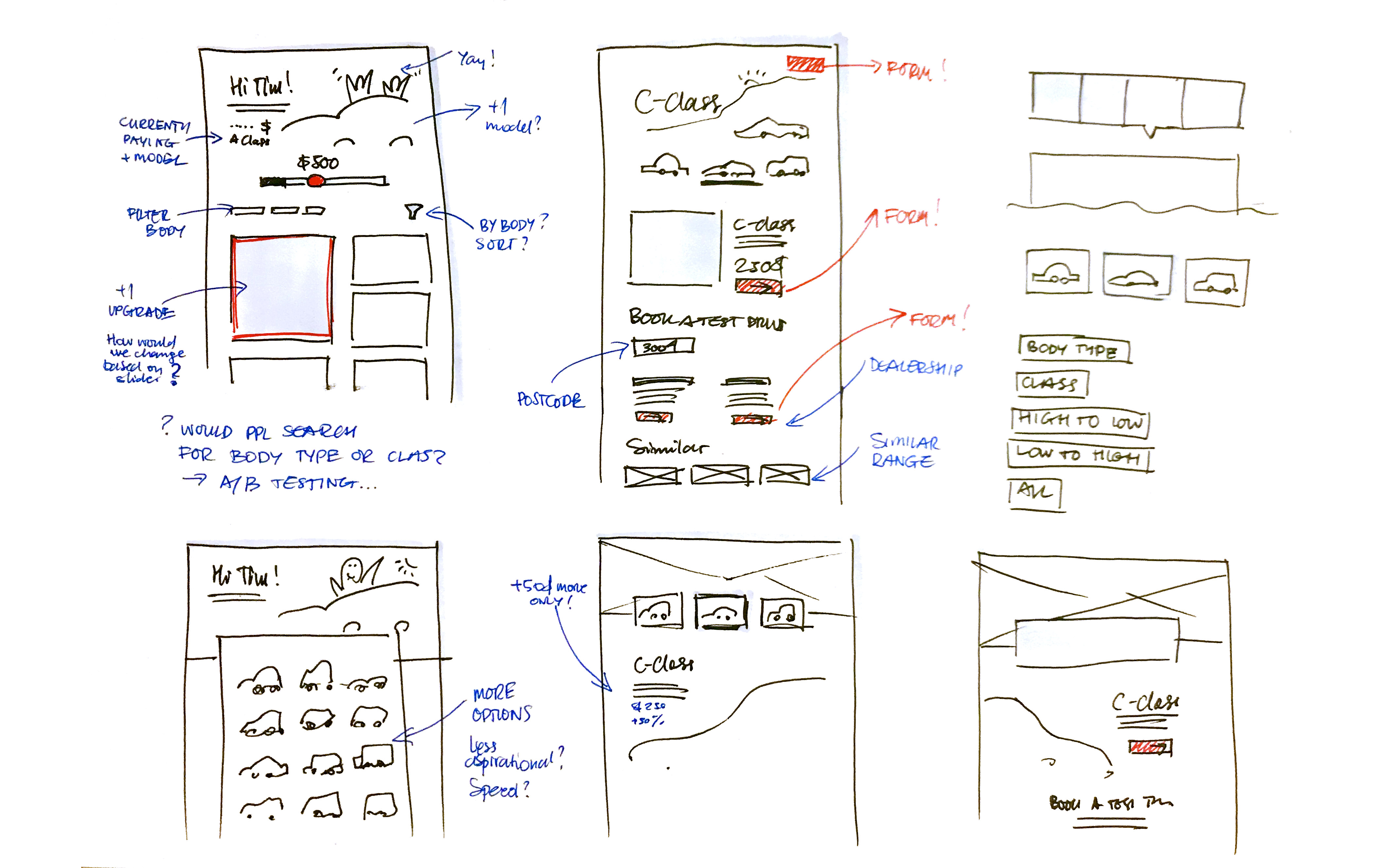
Initial sketches helped me explore different ideas of how to display vehicles, control budget and focus on key flows to conversion. I decided to explore further the solution that showcases all cars in a grid layout and a slider that helps refine the search based on the budget.
I mapped out what other systems will play a role in the overall experience. We needed to acknowledge that exisiting customers will access the tool from their emails and design the experience accordingly.

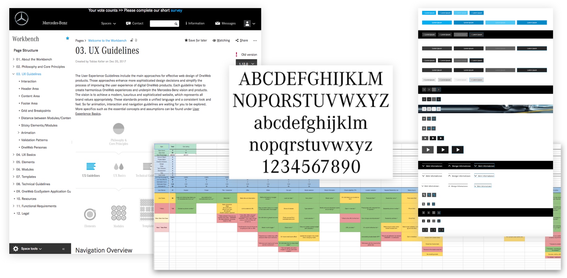
One of the main design constraints that I had to work with was the alignment with the current UX Guidelines provided by the client. In order to entirely understand its limitations, I performed a detail review of the document and it quickly became apparent that some requirements and mandatory elements are rather inflexible. That could effect the overall experience of our solution.
After the discussion with the client we decided to follow the existing guidelines in the first release and improve or break from it where possible in the second release. And that’s what happened, the latter provided much more aspiring and compelling experience and that’s what we agreed on at the end.
Key themes I focused on:
The tool is accessed from the link sent through an eDM and with user’s permission uses their finance information based on the current contract to provide tailored experience and relevant recommendations. As at this point we know customer’s current vehicle model we leverage that and present it in the hero banner. Personalised slider indicates relevant starting point and shows the current repayment in order to compare models.
Every Mercedes class have a varied number of body types and each body type has a few different models. The current database of the available cars includes around 150 options. How would we showcase the most relevant one to the user? My solution leverages understanding of the existing customer data or segments and uses a flexible card grid that gives an opportunity to emphasise on the recommended options. Additionally, easily accessible filters and sorting options accomodate different browsing trends, being suitable for those searching by the class or body type.
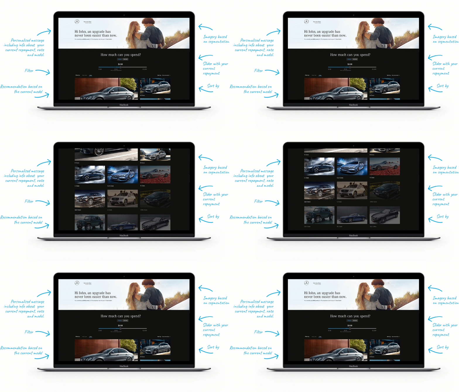
Listing page.
In order to provide actionable next steps I created a clear call-to-action and integrated enquiry form. I also introduced a cross navigation on the detail page showcasing similar vehicles in your range to prompt further exploration.
In order to provide exceptional and inspiring experience that Mercedes customers deserve I explored different ways to showcase cars and introduced lifestyle imagery that helps form the emotional connection between a customer and a car. Additionally, I proposed a number of interactions and micro animations to enhance the overall experience.
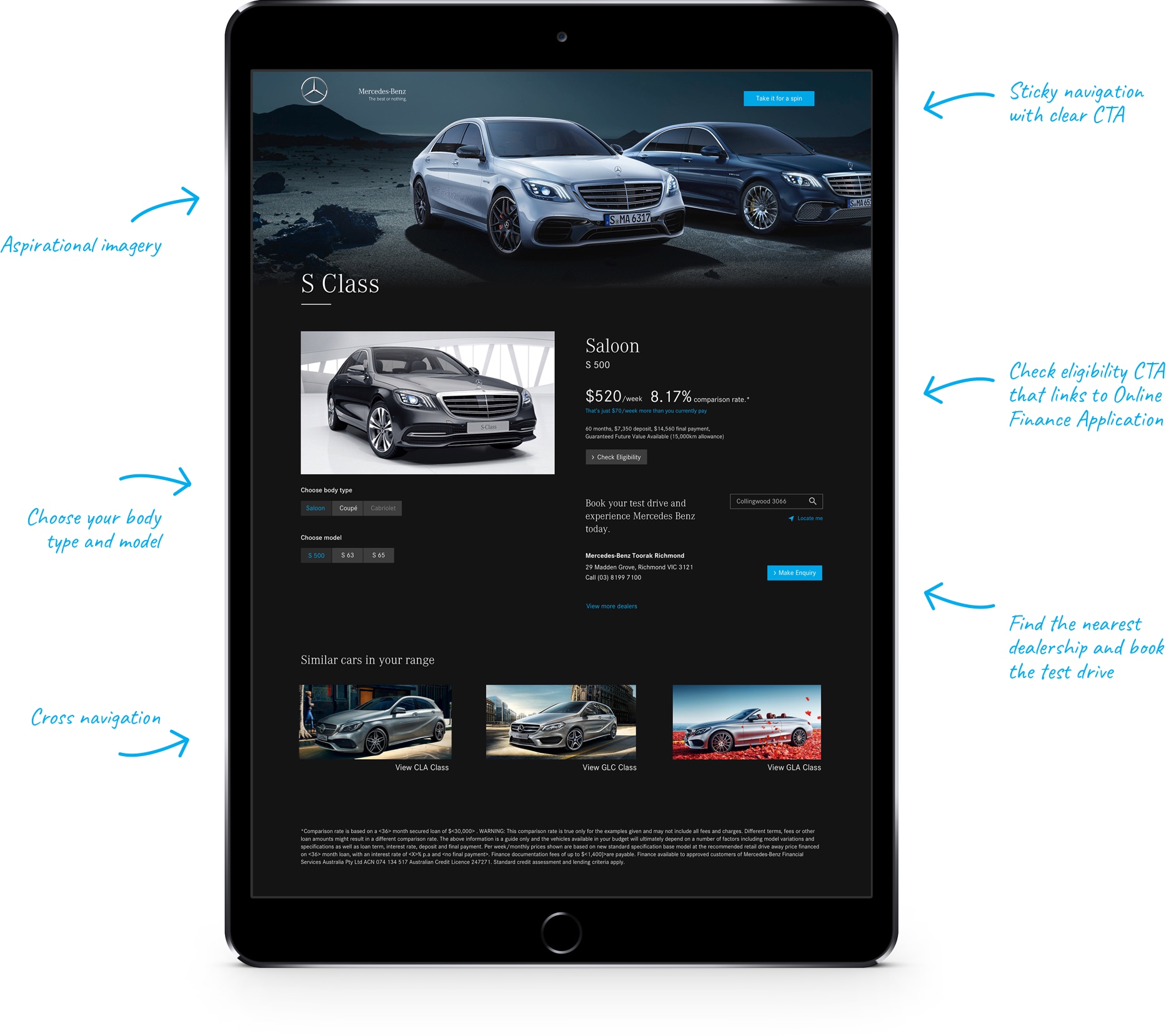
Detail page.
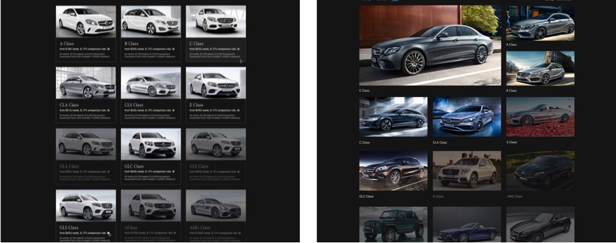
The current solution is an MVP (Minimum Viable Product) that will be tested and built on. Personally, I will be interested in testing results between two options for the listing page. I took two different approaches where the first one focuses on the speed and efficiency to lead the user to the detail page as quickly as possible while the second one provides more guide, inspirational experience.
This project was created by Inlight.