The Vinnies CEO Sleepout.
Simplifying the entire fundraising process.
The St Vincent de Paul Sociaty (Vinnies) CEO Sleepout is an exclusive event that brings together leaders in business, community and government. Participants sleep without shelter on one of the longest nights of the year to raise awareness, fundraise, and help change the lives of Australians experiencing homelessness.
The event has become a great success over the past few years and has established itself as one of the most iconic fundraising events in Australia raising over 5.6 million dollars for people experiencing homelessness last year.
The current fundraising process is complicated. The organisation has recognised the need to develop a more compelling and unique experience that better engages with participants and donors.
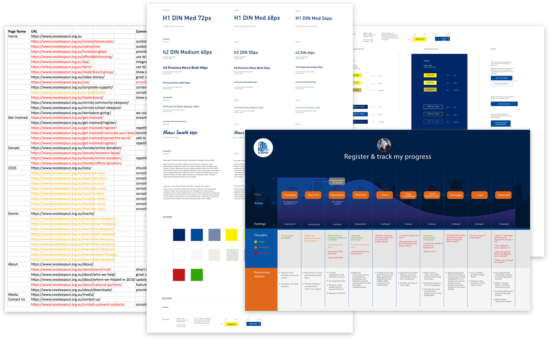
We decided to build our solution on top of an existing crowdfunding platform called Funraisin. We needed to understand its functionality to fully leverage its potential and build a solution that is tailored to the event.
I was a lead designer of the project working closely with a team of engineers and a copywriter. I led end-to-end product design including research, interaction design, and design execution. Additionally, I facilitated workshops and presented works to gain buy‐in from stakeholders throughout the project lifecycle.
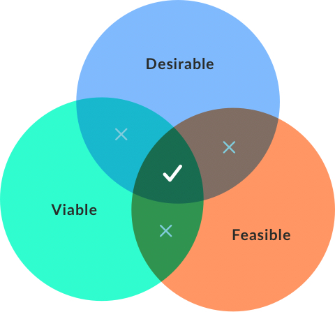
User centric digital solution that creates seamless experience by removing friction points during donation process and simplifies sign ups.
How would we validate how successful the solution is? By comparing the donation amount, conversion rate, and number of transactions.
Results:
59% uplift in average donation amount.
29% uplift in conversion rate.
Total uplift of 1.3 million dollars compared to last year's effort.
I always find it exceptionally rewarding when I get a chance to work on a charity project. That's where my passion for design and social good meet and create an opportunity to help build the world we wish to see. I wanted to thank our wonderful client, stakeholders, and my colleagues for making it all happen!
This case study is a walk through my design process and a showcase of the final solution. In a nutshell, the process I followed is divided into three phases: discovery, ideation and implementation. Throughout phase one I learnt everything I can about the users and business context. During phase two I established a framework, structured functionality and sketched potential ideas. Lastly, I made it all happen during the implementation phase and validated any remaining assumptions.
It was crucial to gain an in-depth understanding of the business and define the approach right at the start of the project. That's why we ran the Business Context Workshop with the client. It's a great way to kick off the project in a collaborative manner as well as quickly identify goals, opportunities, and constraints. In addition to that, we talked to event coordinators to unpack insights on how the website is managed from an administrative point of view.
I performed a user centric UX/UI review on the existing website in order to identify what’s working well and where improvements can be made. I also conducted a global best practice review to explore inspirational examples of online fundraising / event-based websites and apps from around the world.
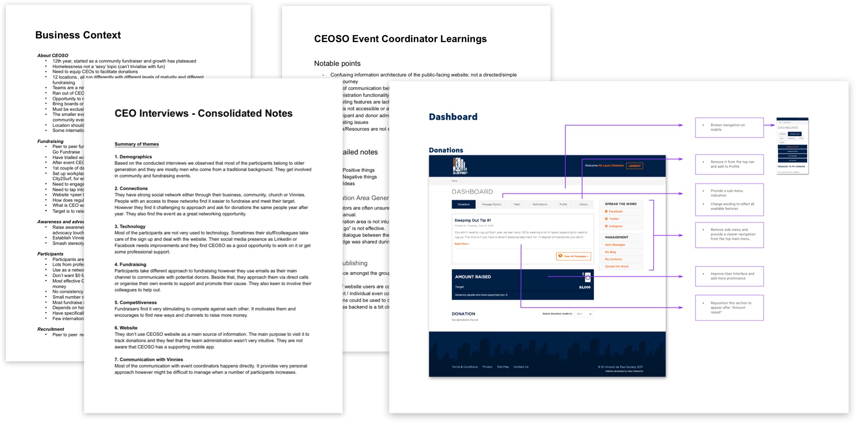
There's no better way to learn about the audience than talking directly to them. I jumped on the phone and performed 20mins interviews with around twenty CEOs to learn what motivates them to participate in the event, how they use the website, and what could be improved. I consolidated all my findings to later on feed it into user flows and accurately identify pain points.
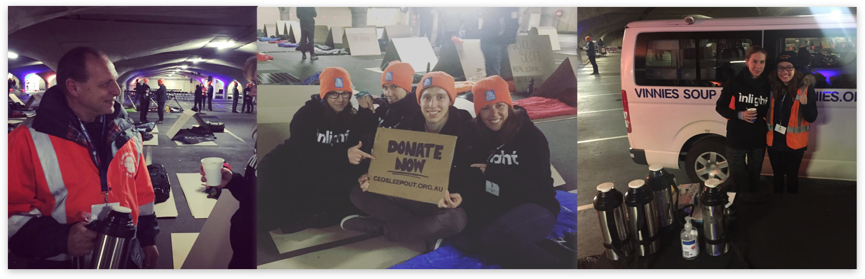
That activity unfolded insights and sparked ideas I would never be able to identify by looking at data. That's why I decided to register for the event itself and gain better understanding of the issue.
My team raised $3,000 by reaching out to our network, friends & family and slept rough on the longest night of the year. It was tough but extremely insightful. Besides understanding the fundraising journey, I recognized the core of the problem, heard stories from people who have suffered homelessness and engaged with participants to identify their motivations.
These activities helped me create personas that accurately represent audience's needs and behaviours. I validated my assumptions with the exisitng data and ran a prioritisation session with the client to shortlist our key audience.
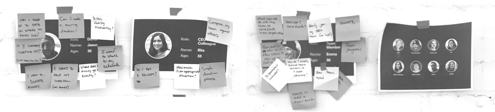
I created a comprehensive list of user stories following “As a___ I want to___ so that I can___” structure in order to prioritise users needs.
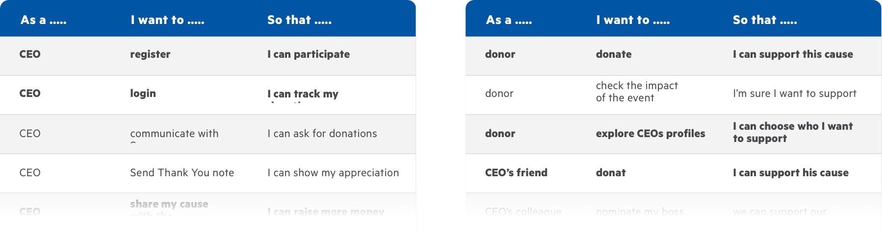
Scenarios helped me understand what motivates users when they interact with a design – a useful consideration for ideation and usability testing.
CEOs:
Donors:
As a final step, I synthesised the findings to define themes and opportunities. At the end of this phase I determined a clear hypothesis and had enough understanding to generate potential ideas.
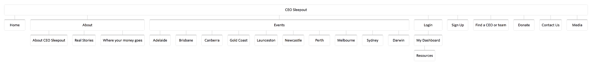
At this phase, I focused on creating a framework and wireframes to share the vision, communicate design principles and content strategy. That was very helpful to gain alignment, structure functionality, and prioritise content.
Flows are just as important to good interfaces as individual screens are. Donors or fundraisers don’t land on screens from out of nowhere. Specific sequences of actions lead them through the experience as they try to accomplish their tasks. Defining it from the user perspective of the site organisation made it easier to identify which steps could be improved or redesigned.
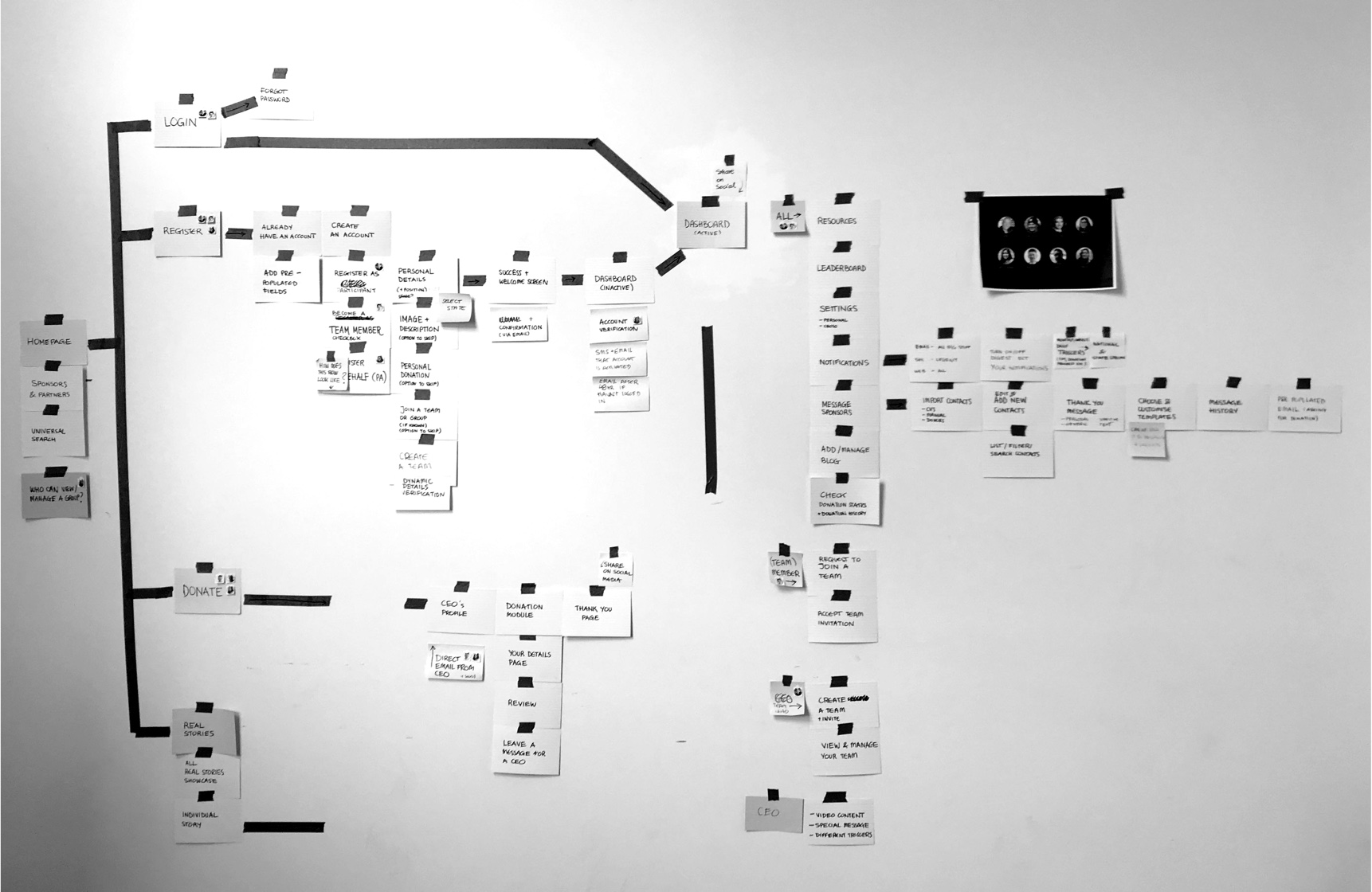
After mapping out all the content, I teamed up with a copywriter and leveraged learnings from the discovery phase and existing data to consolidate, declutter, and remove content. Some of the key actions were to reduce long form body copy, produce more guiding headings, short copy that drives call to action, and more task-focused content. As a result, we defined a simple and intuitive navigation and presented content strategy for the new website.
This is the fun part of design. There are many ways of generating ideas but there are three things that I always try to do: generate numerous ideas, be creative with no limitations and question everything. Keeping this in mind I sketched my ideas and grouped them into themes. I also ran a fun workshop with the stakeholders. I asked them to visualise their own ideas without regard to constraints. It's not only that it gave me a new perspective, but also made them feel closer to the solution that could utilize some of their creative thinking.
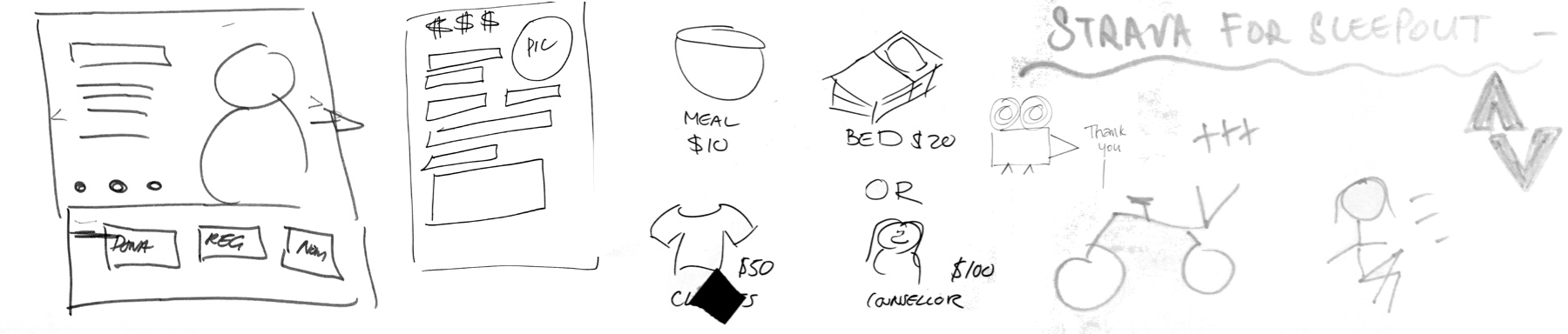
Stakeholders sketches - it's always fun to empower people to get out of their comfort zone.
Sketching different ideas helped me define best solutions and key features.
The key objective during prioritization was to balance customer and business goals while still keeping it feasible.
The biggest challenge I faced throughout this project was balancing moving forward with designs, whilst collaborating with the wider team. Since this project touched on many parts of the organisation, I needed to coordinate and get buy‐in from national teams and state coordinators that were both co‐located and distributed.
Managing feedback was even more challenging trying to accommodate different viewpoints. To overcome this challenge we decided to consolidate feedback that from now on was prioritised and presented to us by the product owner only.
Design principles and the content prioritisation framework helped create visibility into my decision‐making process and galvanise the team to share in the vision. By the end of this phase we all had a clear understanding on the scope, features and we were confident that everyone is aligned on the vision and the product we’re going to build.
Content mapping, design principals and clearly defined user goals helped create visibility.
That’s when I made it all real by bringing the ideas to life. We ensured the team is in the loop and ran fortnightly showcases where all national and state teams could participate and see the progress on the designs.
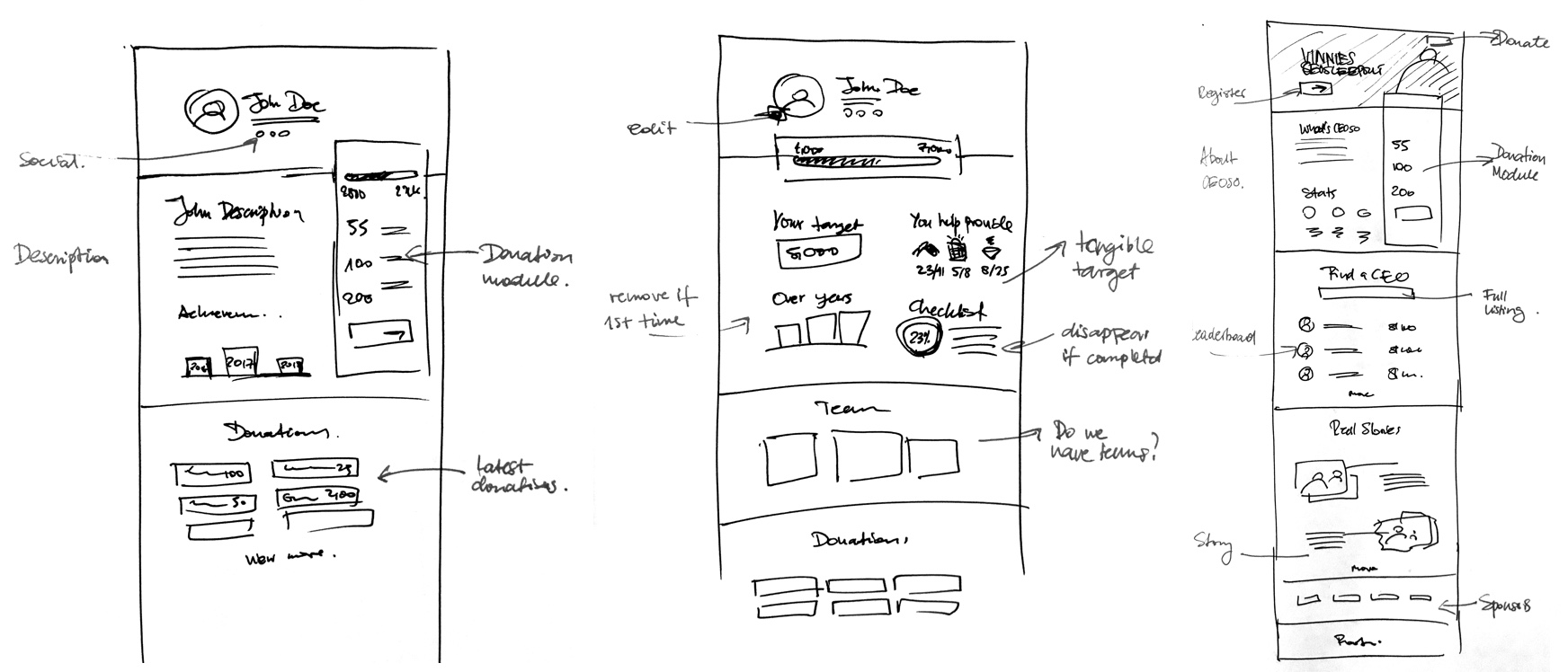
I went through the sign up process myself and was immediatley thrown away by a long page full of fields and questions. It was overwhelming even for a person who has a strong incentive to register. Not to mention a complex confirmation/approval process for every participant. I decided to improve it by simplifying the visual language and breaking up a flow into a few smaller steps. Additionally, I combined, remove, or pre-populated fields, when possible. I also suggested a new feature where participants can kick off their fundraising effort by self-donations.
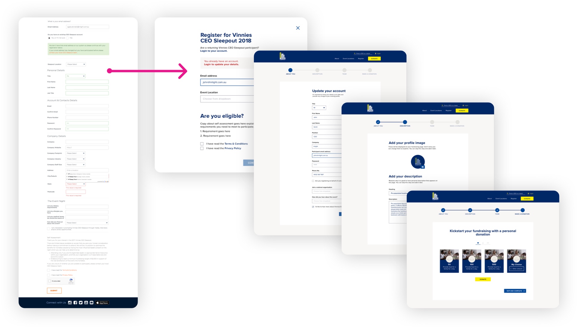
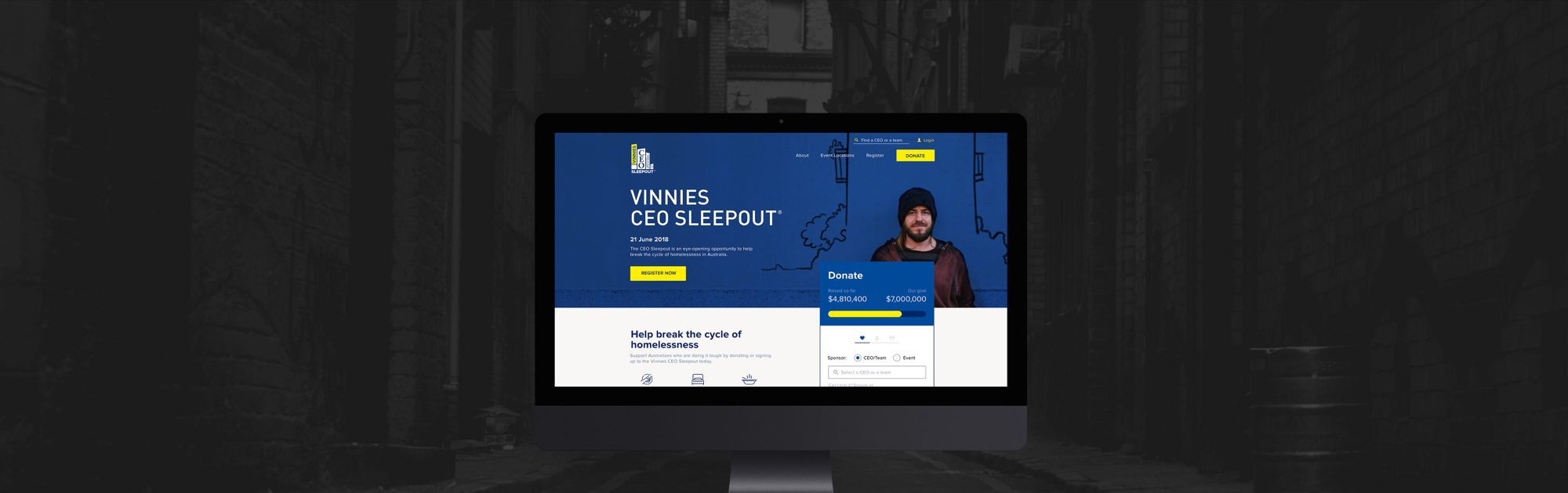
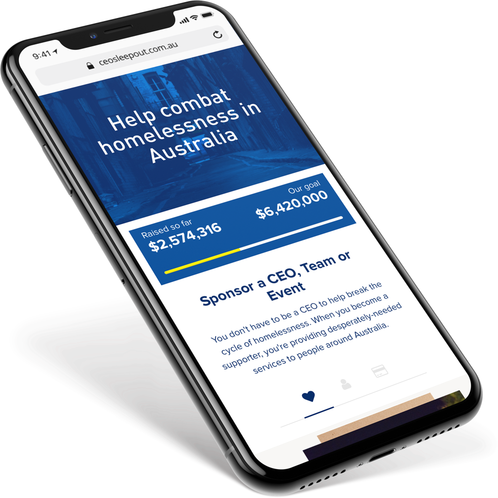
We’ve created an easily accessible donation module that exists on the homepage as well as on the participant page. It presents tangible targets and suggests a preferred donation.
Additionally, donation page includes information about where your money goes and stories from real people who have suffered homelessness sharing their struggles and how Vinnies has supported them throughout their journey.
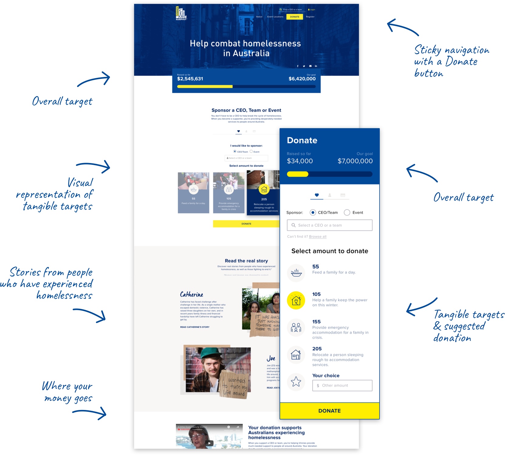
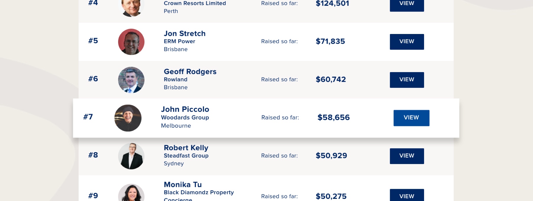
During the discovery session we've defined the competitiveness as important aspect of fundraising and a great motivation for the CEOs. In order to address it, I introduced a leaderboard and a self-donation during registration process.
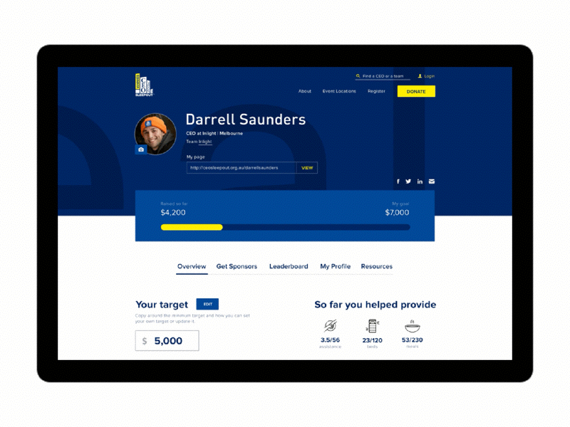
On top of that, every participant gets access to their dashboard where they can track donations, update profile and access resources to support their fundraising efforts. Platform allows to view their previous donations, read personal notes from donors, adjust their target, and many more.
The Vinnies CEO Sleepout project was created by Inlight. Check out Inlight’s case study.