

Bicycle Network.
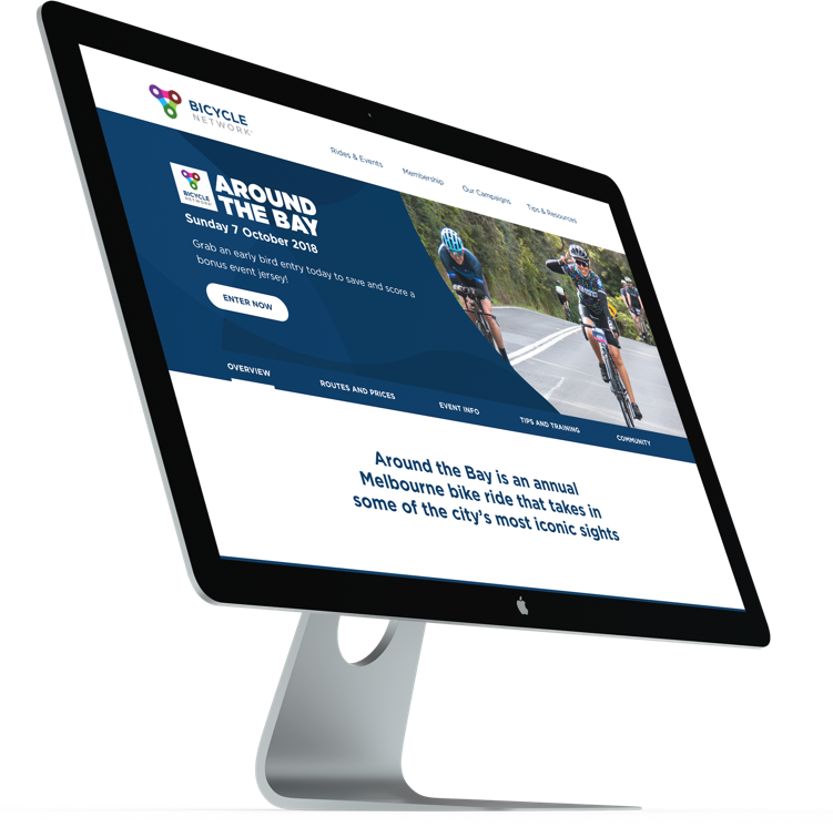
Bike riding made easier for everyone, every day.
Bicycle Network is Australia’s biggest bike riding organisation, supported by more than 50,000 members nationwide. Their mission is to make it easier for everybody to ride a bike, every day.
Create scalable and flexible digital solution that assists organisation’s growth, communicates their mission online and supports the business by recruiting members, raising funds through riding events and promotes advocacy.
Scalable, fast, on brand.
I was a lead designer responsible for developing a new information architecture and content strategy as well as defining users needs. I also led design execution of the project including sketching, prototyping and assisted during implementation.

As a first step I performed a number of activities to help me get immerse in the project, understand the context and identify participants goals.
One of the most insightful activities throughout this phase was learning about different types of riders. After analysing the provided user data, behaviour on the road and running a persona session with the client I gathered enough insights to identify their motivations, challenges, and divergent level of safety concerns. It allowed me to formulate a solution that is based on an in-depth understanding of the users and effectively supports them in gaining confidence on the road.
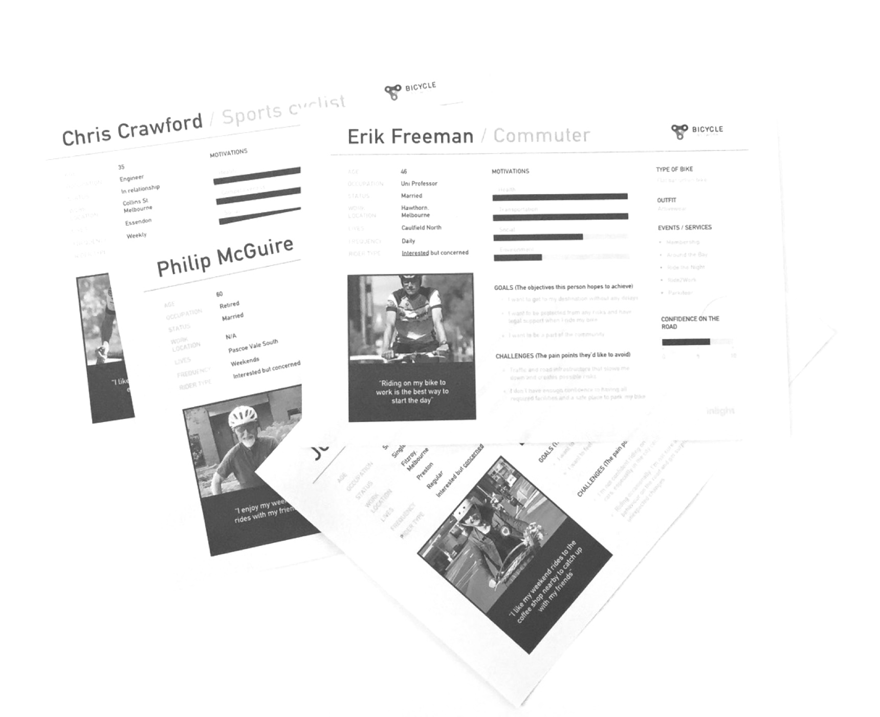
I oftenly use this activity as a part of my design process because it helps shift the focus from writing about requirements to talking about them. It determines who the user is, what they need and why they need it. Following “As a___ I want to___ so that I can___” structure I generated a number of ideas and discussed them with the team in order to shortlist the most relevant stories.

I believe that exceptional experiences are built and validated by the in-depth understanding of the audience. I’m a cyclist, commuting on my bike everyday and actively advocating for the safety on the road but I’ve never participated in a cycling event. I decided to register for one of the main events organised by Bicycle Network and cycle a 100km route around the bay. That was a great challenge but also an opportunity to fully understand the registration process, communication with the organisers before, during and after the event as well as talk to participants and members of the community.

One of the main take aways from this activity, besides a shiny medal, was to recognise the main incentive for people to participate. They get together to build stronger community with fellow riders, challenge themselves and simply celebrate fun activity in a safe environment regardless of the age or fitness level. That sense of community had to be reflected in our solution.

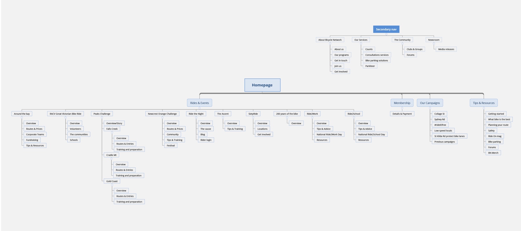
In order to define and agree on the content I performed an audit of the existing website. It happened to be a beginning of the most challenging part of the project. The organisation is very active and frequently publishes updates to keep their members in the loop about their initiatives, petitions and government grants. However, the outdated content was never properly managed or archived. That created hundreds of unrelated pages and links including posts and petitions that were rarely viewed and rather hard to access. I mapped out all the content, analysed and compared against user goals and business values in order to consolidate or remove.
As a result, I significantly reduced a number of pages and proposed a new, more intuitive information architecture.
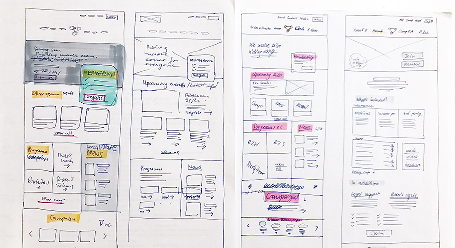
After initial sketches, I worked closely with engineers to review the technical capabilities and developed wireframes. As the website was meant to be content managed, the key was to define consistent language of flexible components and find smart and engaging ways to present modular content.
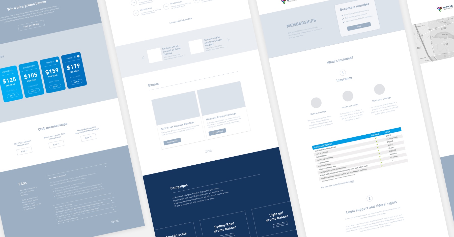
We ran design critiques and reviews along the way to get feedback from the team and the client. As we wanted the project to be implemented as efficient as possible I frequently shared my work-in-progress designs with engineers to find the best solutions and discuss the most feasible approach.
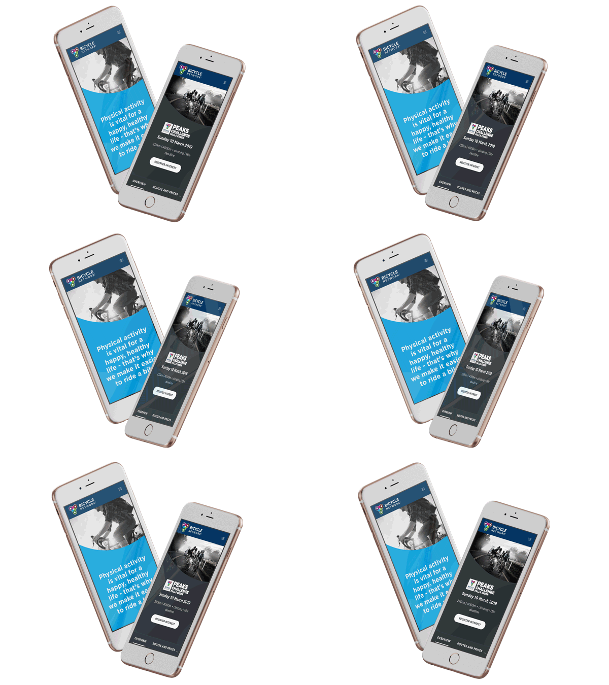
After a few conversations with participants and a closer look at the data I recognised that there’s a significant number of non-members who actively participate in the events but land directly on the event page not realising that they are organised by Bicycle Network. Overall visual language and co-branding was not adequate and did not provide actionable next steps to explore further or learn about the organisation. My solution to this problem was to create strong visual language with bold, recognisable graphics throughout the entire website and assign a unique colour (picked from the logo) for each of the event to easily distinguish them.
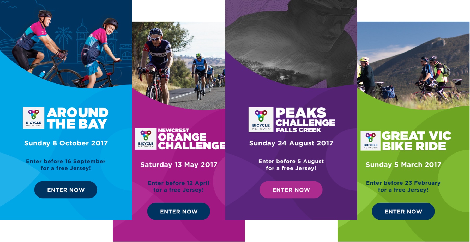
Different rides and events organised by Bicycle Network.
Every event will also have a clear call-to-action and a link to the membership page and other rides.
As the final step, I provided assets and specs and worked with engineers on edge cases and tweaks when necessary.
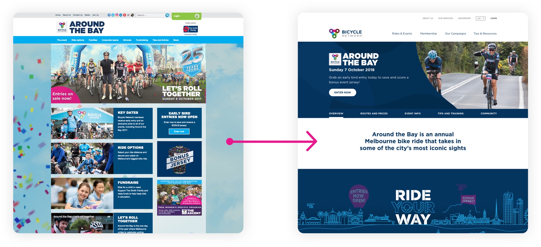
One of the event pages before and after the redesign.
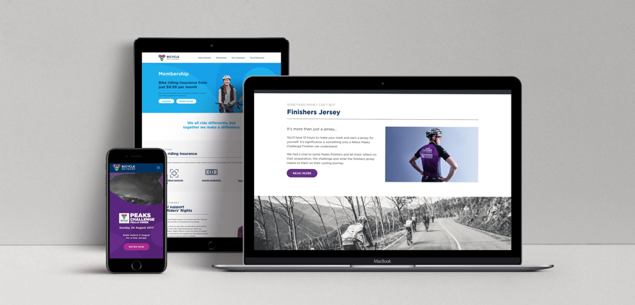
Final designs.
Bicycle Network project was created by Inlight. Check out Inlight’s case study.