BlueJay Music App.
BlueJay Music lets you host your own live public radio shows directly from your phone, building and interact with your followers. You can also keep things smaller and share your favourite playlists in real-time while chatting with your friends. Or follow your favourite curators, artists, and friends to discover new music, hear forgotten gems, and listen to the songs they love with them.
A rapid change in music consumption habits and highly competitive streaming music industry made it clear for BlueJay Music that existing solution had to be improved in order to create more engaging experience for the users.
Current experience is confusing and does not present simple way to create or engage with the music.
Create a simple and cohesive digital experience fast in order to validate assumptions and iterate. In order to achieve it I applied the 5-day sprint methodology and performed a number of activities from “Sprint: How to Solve Big Problems and Test New Ideas in Just Five Days" by Jake Knapp from Google Ventures.
Discovery, ideation and design execution of the project.
Final product is available on Apple Store and Google Play:


Based on the exisiting research and insights I defined two key users of the app:
I mapped out both flows:
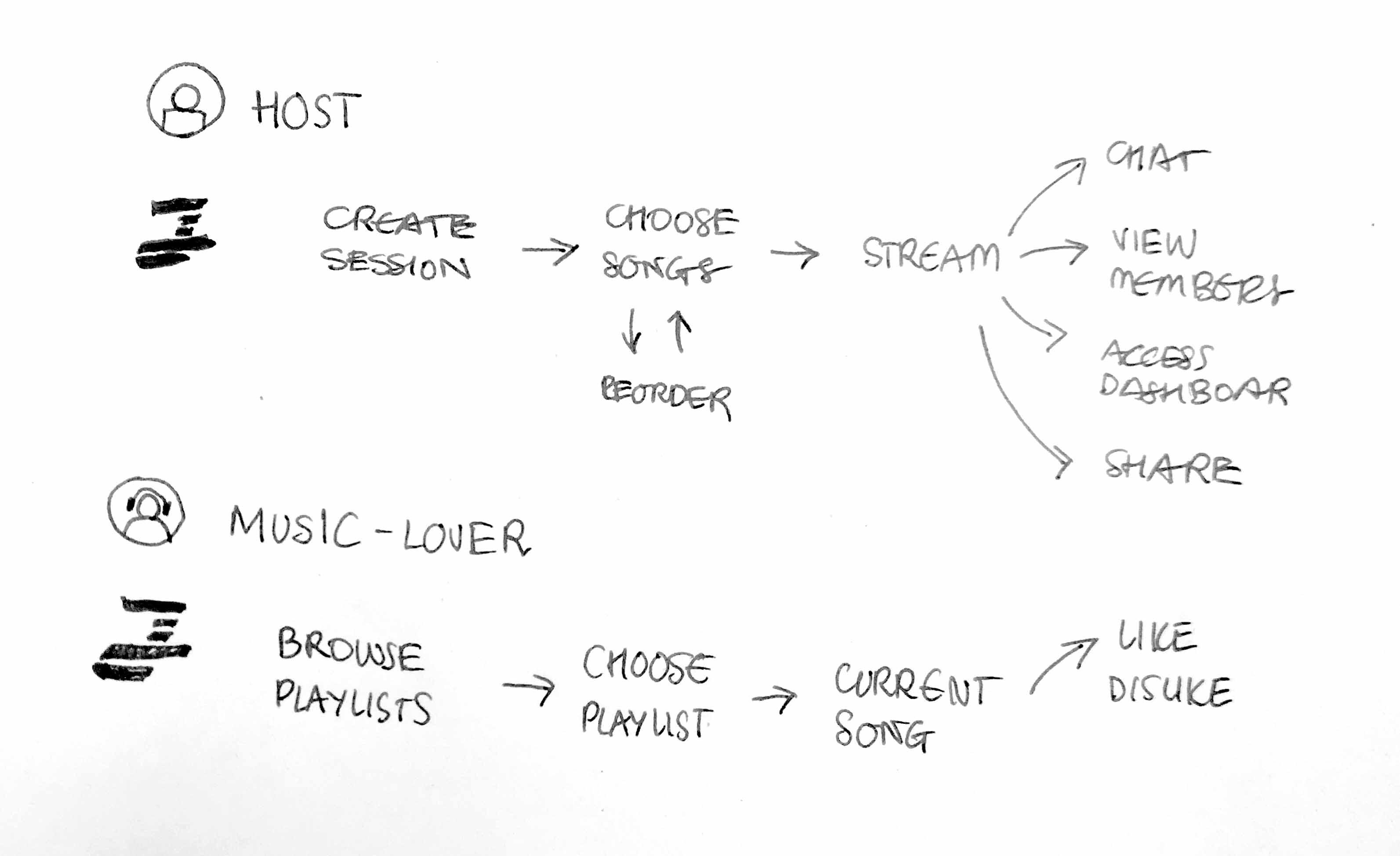
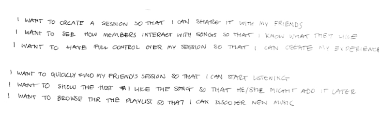
And prioritised their needs based on scenarios following “I want to… so that I can…” structure for both personas.
As a result, I’ve defined key criteria for the solution to be successful:
This task helped me define areas that need the most attention and how the overall experience can be enhanced while still keeping it simple.
At this stage we agreed on the long term goal, mapped out the challenge and picked the target.

In order to explore different solutions and interactions from all types of apps I conducted a global best practice review. I was mostly looking for existing apps that nailed content discoverability and browsing experience. Examples, as seen below, include travel apps like Airbnb with their swipe interaction, Soundcloud with their grouping idea, iHeartRadio and Apple Music’s favouriting feature, and others like Spotify with “in session” controls and bottom navigation.
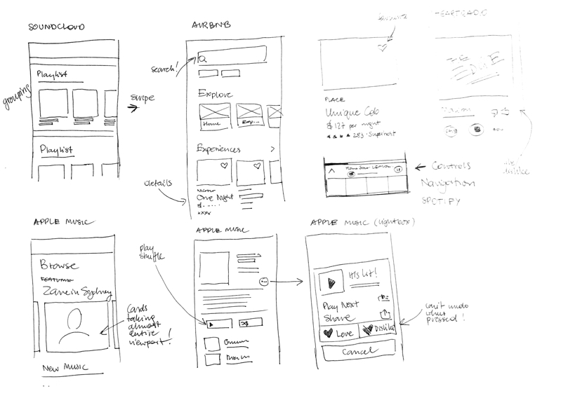
What I really liked about Airbnb and Apple Music was the focus on providing exceptional browsing experience and making them very easy to discover as well as providing contextual call-to-action. Being a Spotify and Soundcloud user it was great to explore alternative solutions and leverage learnings from them.

Once I gathered and narrowed down all my inspirations, I spent some time hashing out different variations/ideas for the screens, after which I was able to decide which ones stuck out the most.
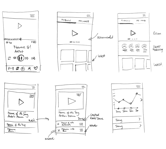


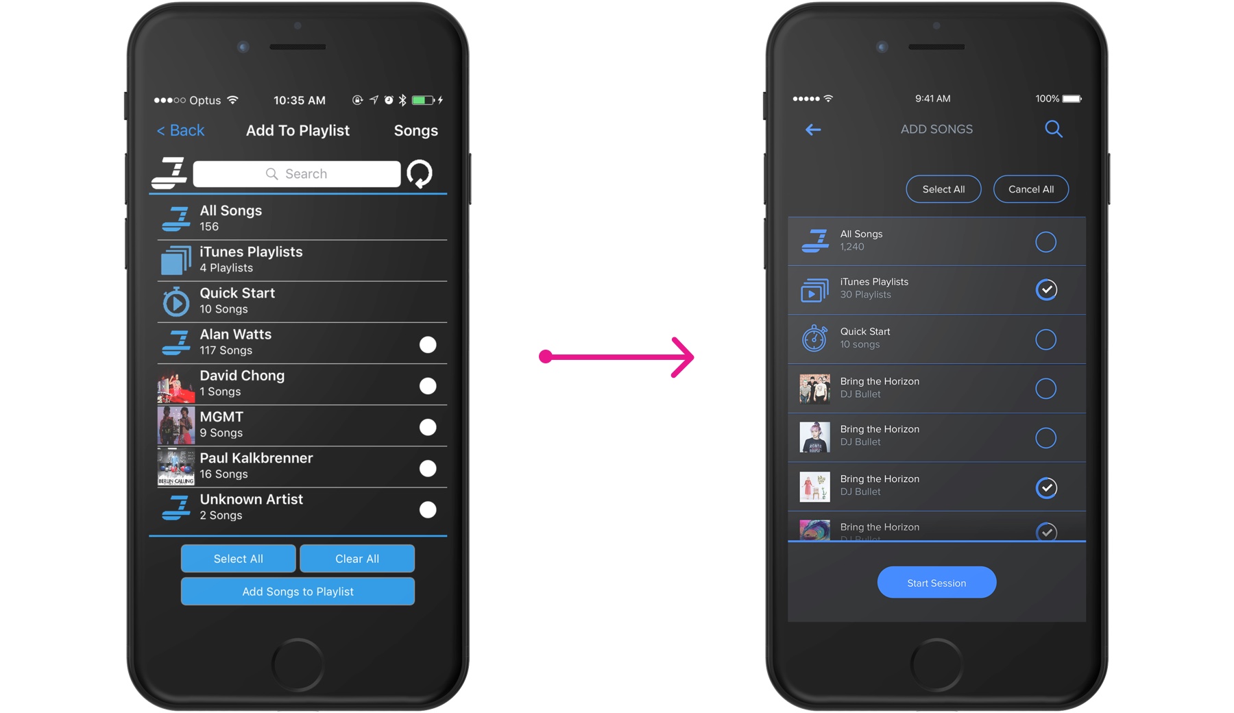
"Add to playlist" feature - before and after redesign.
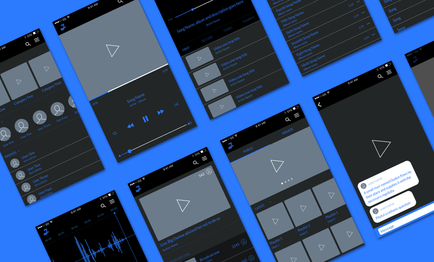
And that's how selected screens of the final solution look like.
For host:
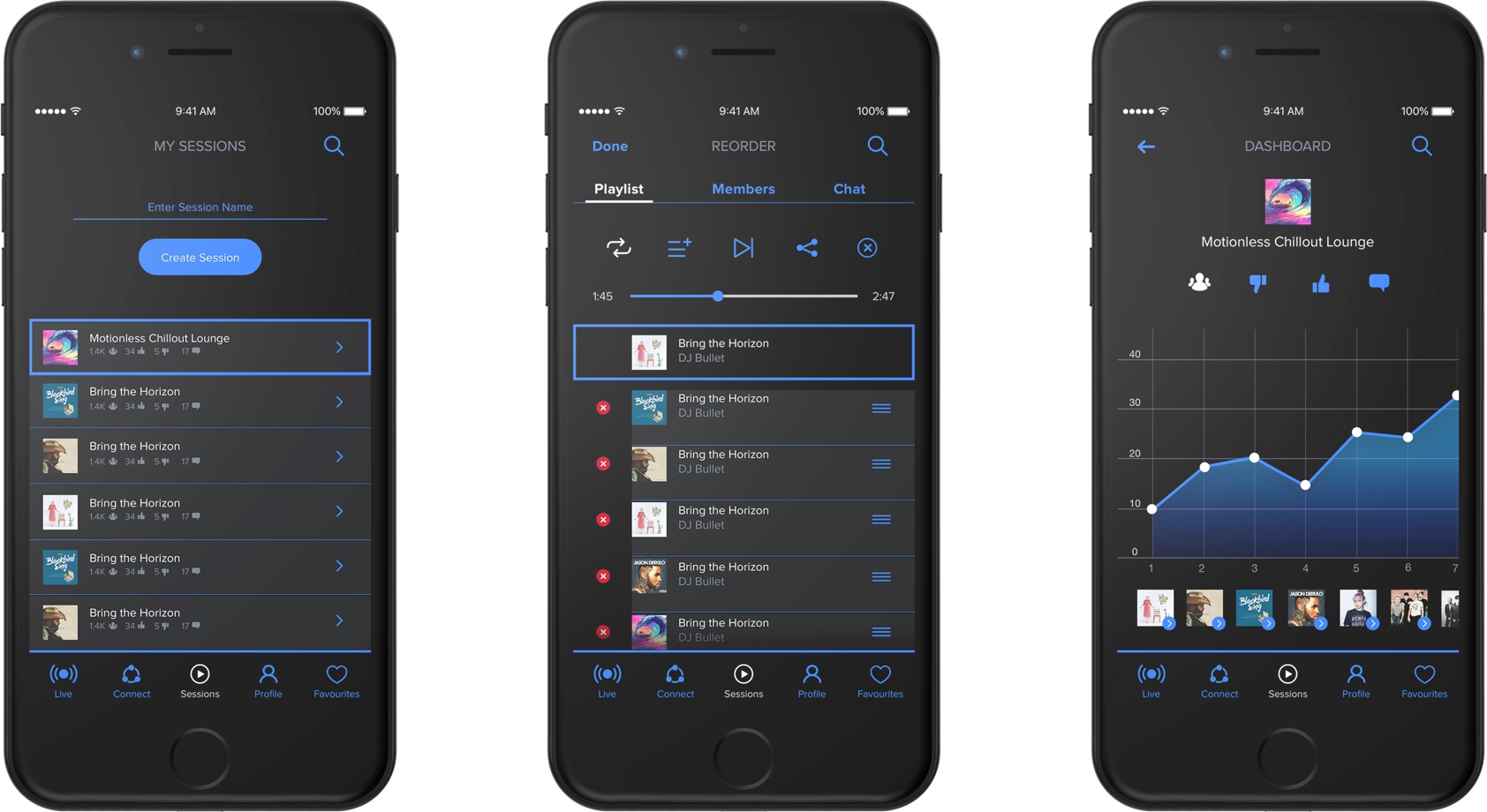
(Left) Create session. (Center) Reshuffle/remove. (Right) Dashboard.
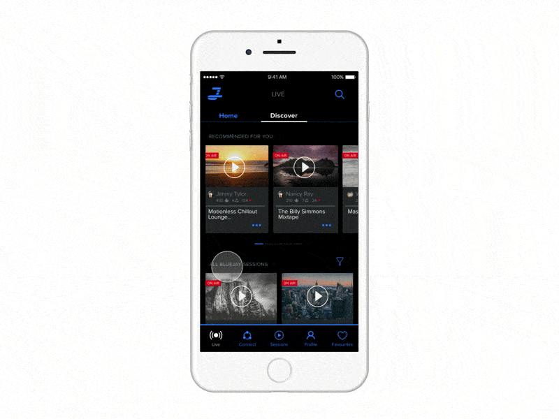
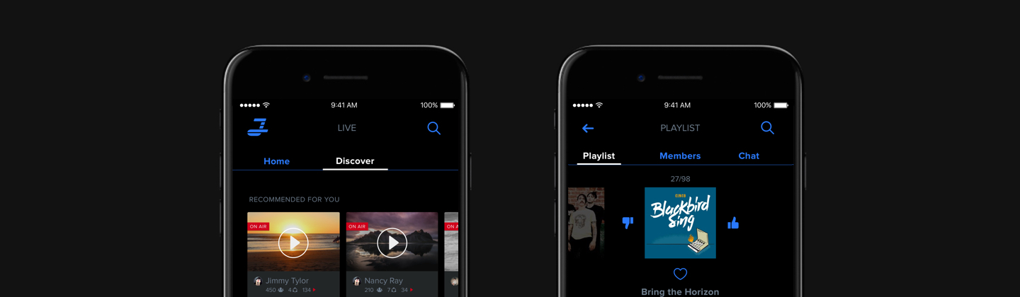
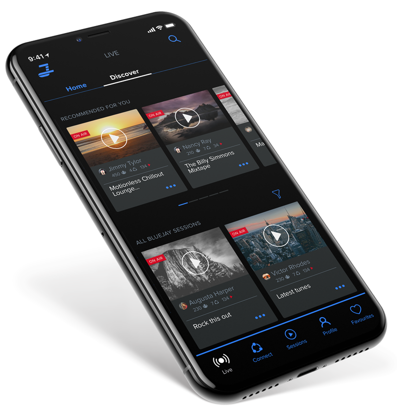
For listener:
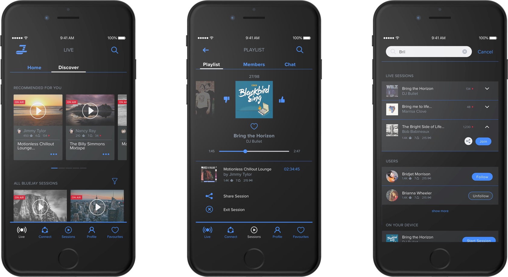
(Left) Browse live playlists. (Center) Listen and interact with a playlist. (Right) Search.
As a last step, before handing over the designs to developers, I proposed a number of interactions in order to enhance overall experience.